Add depth to data and enhance your spreadsheets with simple formatting changes
Level up your data representation in Google Sheets by using color gradients. Explore how these smooth transitions between hues offer more than just visual appeal—they can show trends, emphasize patterns, and bring data significance to life.
This article also explores how to make a color gradient in Google Sheets through conditional formatting, an effortless way to enhance your spreadsheets.
What is a color gradient?
A color gradient is a gradual transition between two or more colors. The colors blend creates a smooth progression as seen in a rainbow or a prism. People often use color gradients to fill areas, such as in artwork, website backgrounds, and spreadsheet elements. Color gradients add depth that you don't get from flat, solid-colored sections.
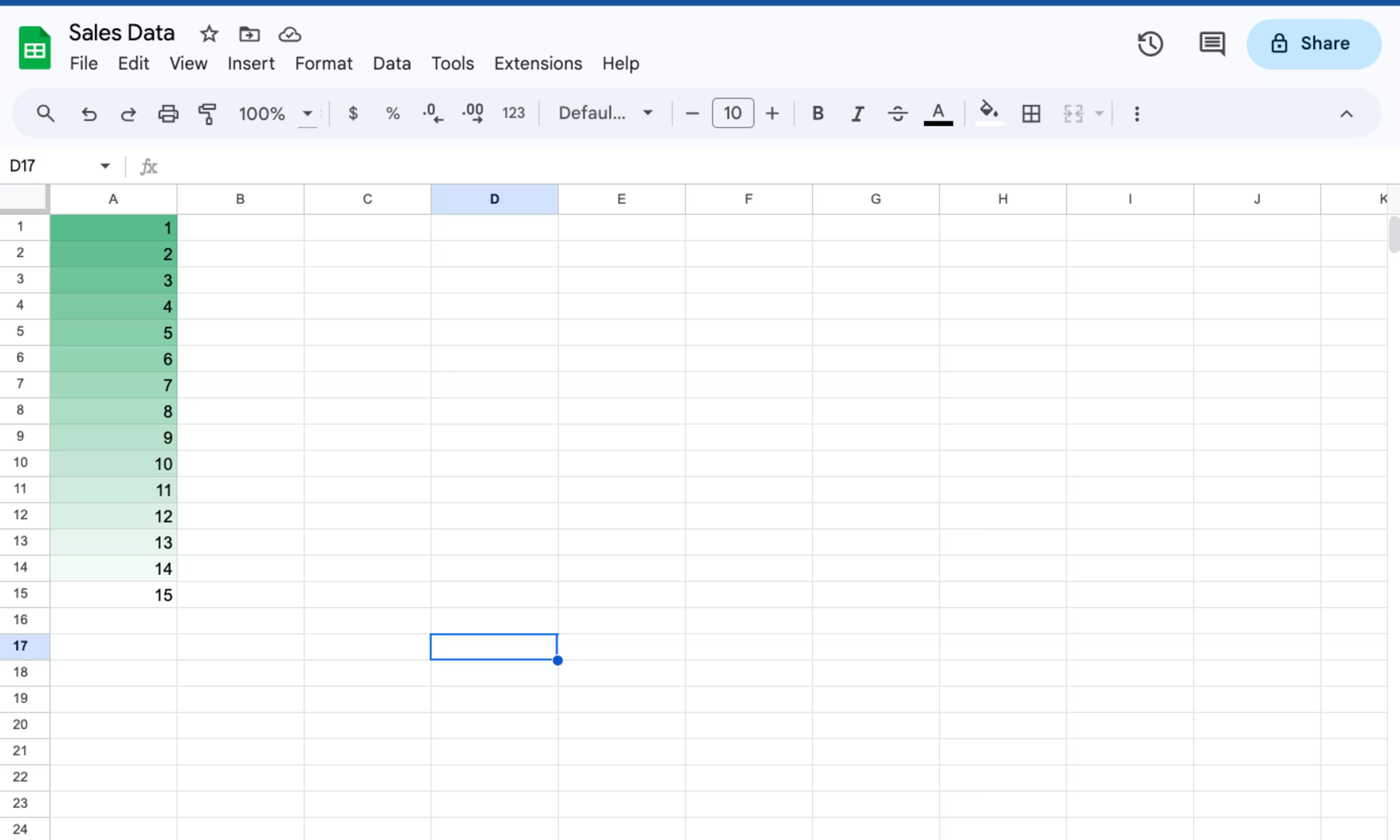
In Google Sheets, color gradients visually represent data variations. For example, say you have a column of numerical sales figures. You can use conditional formatting to apply a color gradient to the cells in that column. You might set it so that cells with lower values have a lighter color while those with higher values have a darker color.
Color gradients in Google Sheets can make it easy to spot trends, patterns, or extremes in your data. Overall, it enhances the visual representation of information in your spreadsheet.
When should you use a color gradient in Google Sheets?
In Google Sheets, you might apply color gradients for various functional and aesthetic purposes. Some of the more common methods include the following:
Showcasing data variations
Color gradients are most commonly used to highlight data variations. As mentioned, you can apply color gradients to highlight low versus high data values. You could also use color gradients instead of solid colors for data bars representing a range of values in a cell.
Displaying variations in charts and graphs
Charts created in Google Sheets are great places to use color gradients. You can apply color gradients to various elements, such as bar charts or pie charts. For example, use color gradients as the fill color of bars or segments to emphasize specific data points.
Customizing your data sets
Color gradients can be utilized for background colors, text colors, or other elements in Google Sheets. While not as commonly used as conditional formatting or in charts, gradients can be applied to specific cells or ranges to make particular data stand out or to create appealing designs.
Applying to shapes and drawings
You can apply color gradients to any shapes and drawings you incorporate into your Google Sheets. Apply gradients to create attractive illustrations or annotations with your spreadsheet.
Adding to sparklines
When using sparklines (small, inline charts that highlight data trends) in Google Sheets, you can customize their appearance. Color gradients make sparkling trends more distinct or show changes in data more vividly.
Use in themes and templates
While not a direct application within Google Sheets, you can incorporate gradients into the themes and templates used in Sheets. Themes may include gradient-based color schemes applied to the spreadsheet elements for a consistent, aesthetically pleasing look.
These methods help enhance data representation, making it much easier to interpret and understand the information presented in the spreadsheet. Color gradients also make otherwise dull spreadsheets look more visually appealing.
How to make a color gradient in Google Sheets
You can use conditional formatting to add color gradients to Google Sheets.
Using conditional formatting
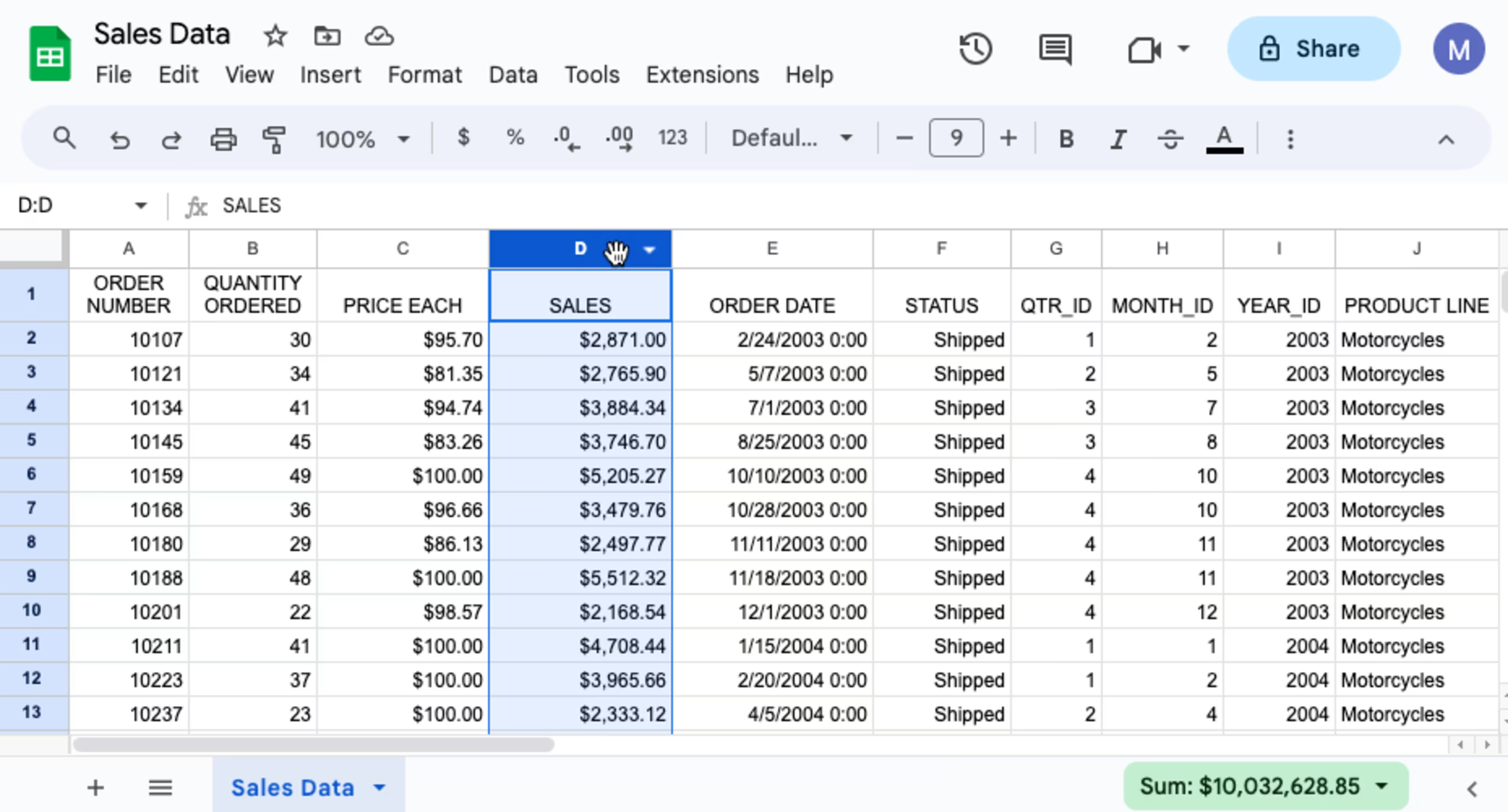
Step 1: Select column
Click on the column to select the data you want to add a color gradient to.
Step 2: Click "Conditional Formatting"
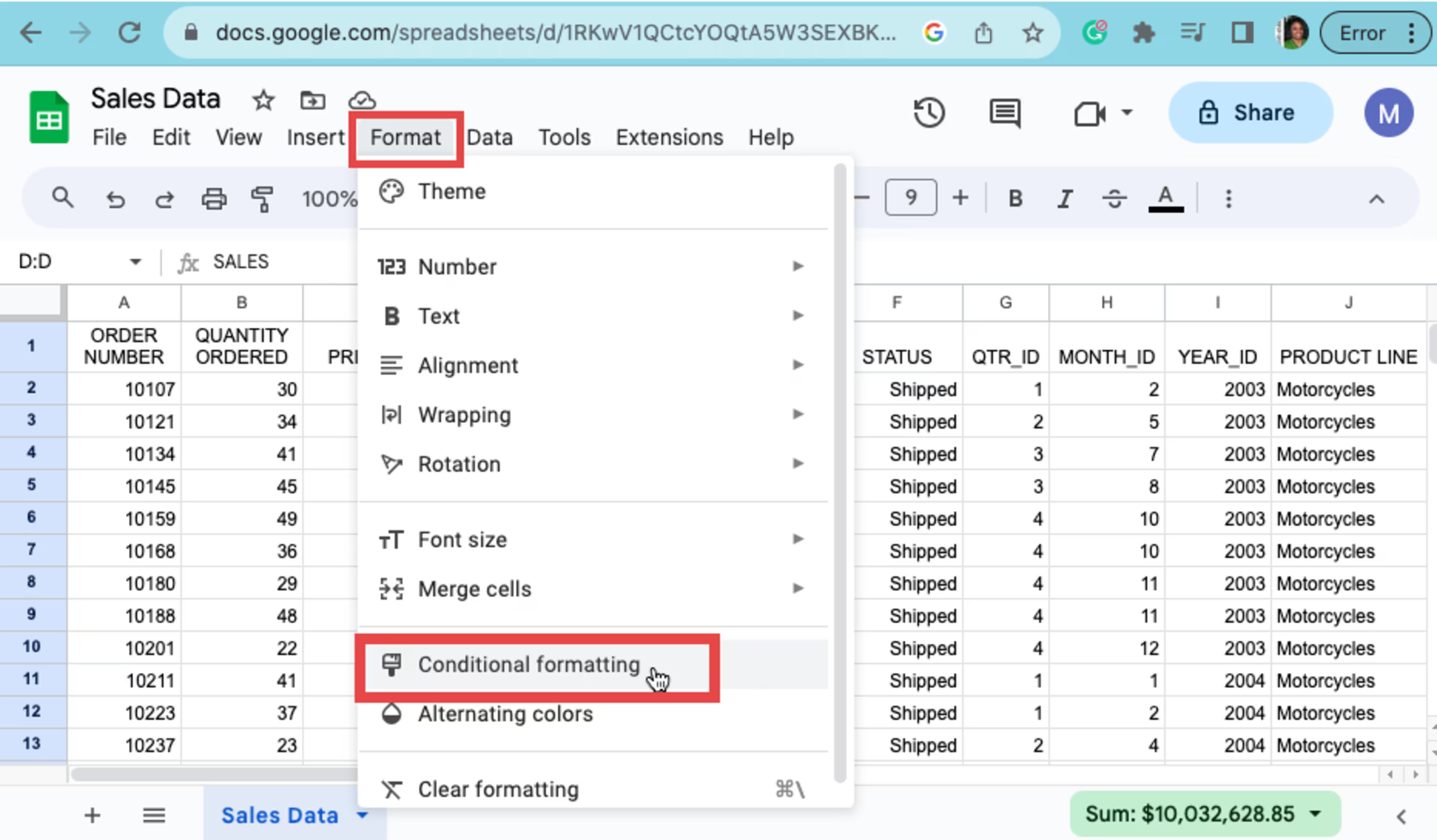
Click on "Format" and then click on "Conditional Formatting."
Step 3: Switch to "Color Scale"
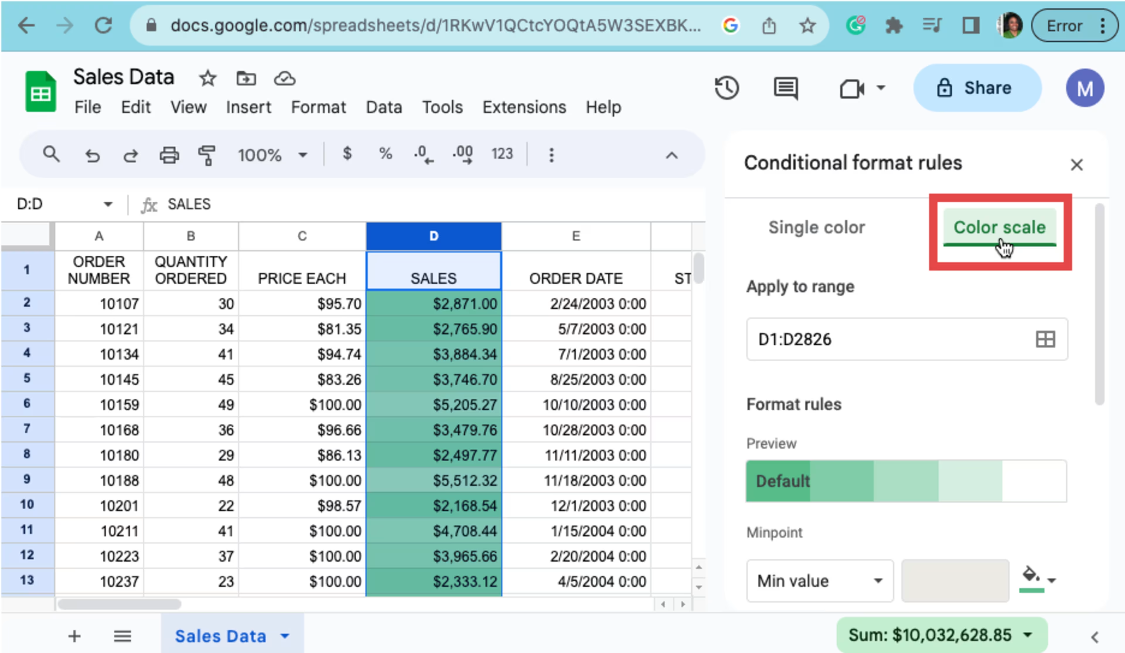
After selecting conditional formatting, the data range will automatically be populated in the "Apply to Range" space. Now click "Color Scale" to switch from a single color to a color gradient. Google applies a default color (green) and automatically identifies the low and high values in the data set.
Step 4: Change the default color
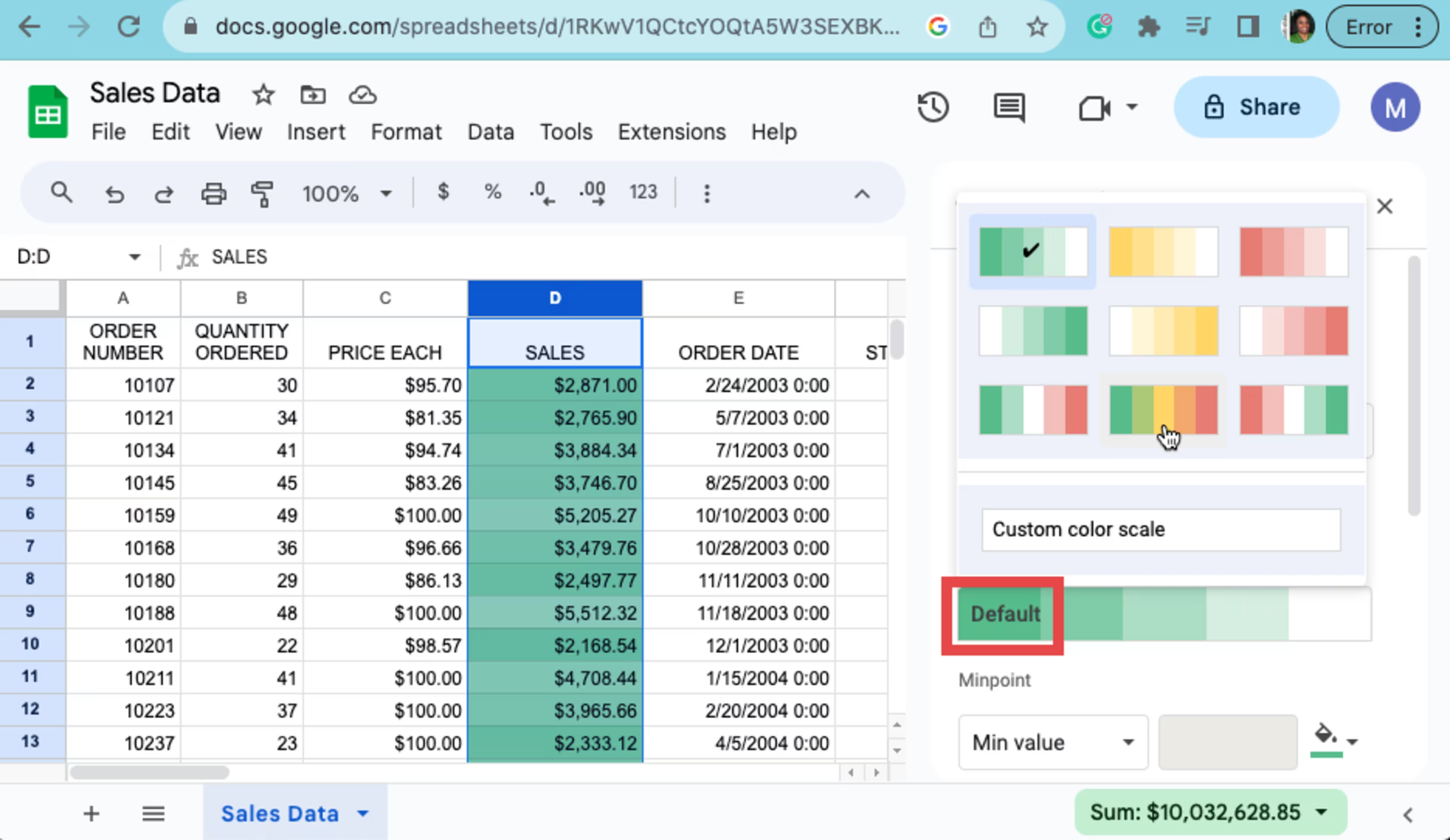
To change the default color, click the "Default" preview section. Then, select the desired color scale theme.
Step 5: Preview the new color gradient
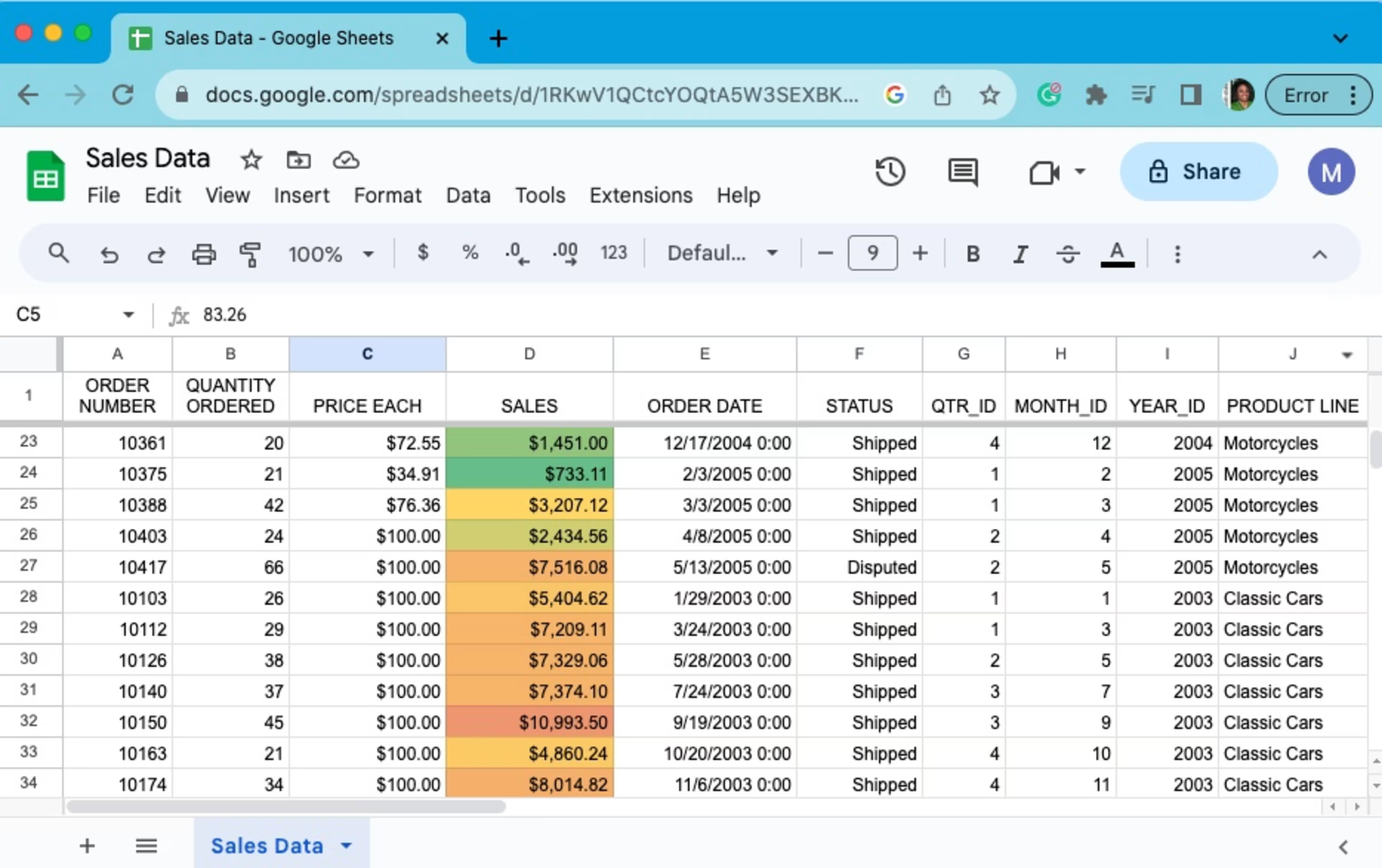
Once you've selected the color scale theme, click "Done" and scroll up to click "X" to close the conditional formatting panel.
Explore other ways to enhance your spreadsheets
Using color gradients in Google Sheets is a strategy that will help enhance your spreadsheets and make your data easier to understand and interpret. But it doesn’t have to stop here. Compare popular spreadsheet software programs so you can make an informed decision. For more related how-to articles, check out the following resources:
The steps to make a color gradient in Google Sheets were researched in November 2023. The screenshots were provided by the author and reflect how to perform such steps on a desktop and are subject to change. Refer to Google Support for additional information.

